

Reblogged (with permission) fromJennifer Marohasy.com
The Hon Greg Hunt MP,
Minister for the Environment.
Minister for the Environment.
Dear Minister Hunt,
I wrote to you on 4th March 2014 with concerns that the claims made by the Bureau of Meteorology that 2013 was Australia’s hottest year on record, are somewhat deceptive. In that letter I explained that the official temperature record has been truncated to begin in 1910 (thereby excluding the hot years of the Federation drought) and that the method used to calculate the annual average temperature for Australia is not transparent.
I’ve since come to understand that the annual average temperature for 2013, which the Bureau claimed was a record, is in fact a wholly contrived valued based on modeling of temperatures, rather than the averaging of actual recorded values. That is, careful scrutiny of the Bureau’s methodology shows that recorded temperatures at locations across Australia are submitted to a two-step homogenization process that can have the effect of changing the entire temperature trend at specific locations. A weighted mean of these ‘homogenized’ values is then used in the calculation of the Australian annual mean temperature. In turn, the ‘homogenized’ values are used by the Intergovernmental Panel on Climate Change (IPCC), which gives advice back to the Australian government on global and Australian temperature trends.
A problem with this approach is that it can deliver an impression of climate change which accords wholly with expectations. But, it is reality that Australians should be planning for, so it would be better if the Bureau used real data, rather than modeled output when reporting temperature trends. Indeed to quote Aldous Huxley, ‘Facts don’t cease to exist because they are ignored.’
At the invitation of the Sydney Institute, I will be giving a talk on 25th June 2014, that shows the detail of how this methodology is applied, using the locations of Bourke in western NSW and Amberley in Queensland as case studies. I encourage attendance from the Bureau to scrutinize my presentation for accuracy. Indeed, all Australians should have a clear understanding of the nature of the data used in the calculation of important and highly publicized temperature statistics. All Australians should also have access to a realistic assessment of current temperature trends.
Very recently it was brought to my attention that Graham Williamson wrote to Rob Vertessy, Director of Meteorology at the Bureau, also querying the claimed increase in temperatures. Mr Williamson, in his letter of 27th May 2014, specifically asked why the Bureau of Meteorology did not acknowledge the 15-year hiatus in global warming as detailed in the recent report from the Intergovernmental Panel on Climate Change (IPCC, Chapter 10, AR5). In reply to Mr Williamson, Neil Plummer from the Bureau has suggested that the IPCC is simply referring to a slow down in the rate of global warming, rather than a pause as such. Given the IPCC reports are based on temperature trends derived from ‘homogenized’ data, rather than real observational records, I am concerned that they may also not be giving a true picture of recent climate change. To reiterate, even the IPCC is using modeled output rather than real data.
As part of ongoing research into natural rainfall patterns in Queensland, Professor John Abbot and I have been studying the temperature record for northeastern Australia, as temperature is a key input variable in our neural network models (e.g. Abbot and Marohasy 2014). Considering the data from the late 1800s until 1960, a cooling trend is evident, followed by warming between 1960 and 2001. In contrast, the last 12 years show quite dramatic cooling, Table 1. All three periods have occurred while greenhouse gases, particularly carbon dioxide, have been increasing in concentration in the atmosphere.
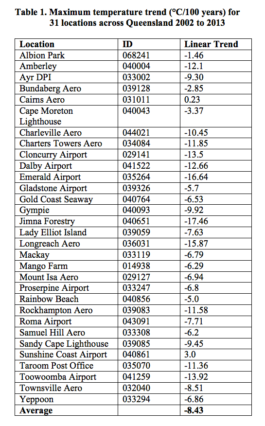
Our analysis of the maximum temperature trend for the years 2002 to 2013 is based, not on the modeled temperature values used to generate official temperature statistics, but on the unadjusted observed temperatures also available from the Bureau of Meteorology website. The thirty-one sites across Queensland were chosen on the basis that there is a continual temperature record for the period 2002 to 2013 at each of the locations. We choose 2002 as the start date, as the data suggests a change in trend at about this year from warming to cooling. This is consistent with published studies by astrophysicists and physicists (e.g. Nicola Scafetta 2010, Abdussamatov 2012, and Lu 2013) and closely follows the timing of the last solar maximum (eg. NASA update 02/05/2014,http://solarscience.msfc.nasa.gov/predict.shtml). While Table 1 is limited to Queensland, preliminary assessment of data from NSW, Victoria and the Northern Territory also suggests the onset of a cooling trend.
This information is in stark contrast to the information in the State of the Climate Report 2014 recently published by the Bureau and also CSIRO. The report states that “warming over Australia has been consistent” and temperatures are “projected to continue to increase, with more hot days and fewer extremely cool days.”
In order to reconcile the information in Table 1, with the claims in the State of the Climate Report 2014, it is important to realize that, like the calculation of the annual mean temperature for Australia, data present in the report is based wholly on modeled output. That is observed temperature values have been first passed through a two-step homogenization process involving the application of complex mathematical algorithms.
It is important to make a distinction between output from a computer model and real data. In his bookScience and Public Policy: The virtuous corruption of virtual environmental science Aynsley Kellow, Professor and Head of the School of Government at the University of Tasmania, shows through many examples, including from climate science, how a reliance on computer models over the last 30 years as well as the infusion of values, has produced a preference for virtual over observational data. But the Australian public and Australian industry deserve much better from the Bureau.
As an Australian scientist with a keen interest in public policy and temperature records, I ask you as the Minister ultimately responsible for the activities of the Australian Bureau of Meteorology, to consider how you might reconcile increasing atmospheric concentrations of carbon dioxide with a falling temperature trend, and what needs to be done if we are to adequately prepare as a nation for the possible onset of a period of sustained cooling.
Yours sincerely
Dr Jennifer Marohasy
Adjunct Research Fellow
Central Queensland University
Adjunct Research Fellow
Central Queensland University
Links/References
Letter from Jennifer Marohasy to Minister Greg Hunt, 4th March 2014
http://jennifermarohasy.com/questions-for-the-australian-bureau-of-meteorology/
http://jennifermarohasy.com/questions-for-the-australian-bureau-of-meteorology/
John Abbot and Jennifer Marohasy, 2014. Input Selection and optimization for monthly rainfall forecasting in Queensland, Australia, using artificial neural networks, Atmospheric Research, Volume 138, Pages 166-178.
Nicola Scafetta, 2010. Empirical evidence for a celestial origin of the climate oscillations and its implications, Journal of Atmospheric and Solar-Terrestrial Physics, Volume 72, Pages 951-970.
Habibullo I. Abdussamatov, 2012. Bicentennial decrease of the total solar irradiance leads to unbalanced thermal budget of the Earth and the Little Ice Age, Applied Physics Research, Volume 4. DOI: 10.5539/apr.v4n1p178
Qing-Bu Lu, 2013. Cosmic-ray driven reaction and greenhouse effect of halogenated molecules: culprits for atmospheric ozone depletion and global climate change, International Journal of Modern Physics B, Volume 27, DOI: 10.1142/S0217979213500732
Bureau of Meteorology and CSIRO 2014, State of the Climate 2014 http://www.bom.gov.au/state-of-the-climate/documents/state-of-the-climate-2014_low-res.pdf?ref=button
Note From Jennifer:
ReplyDeleteHi Geoff Brown
I would appreciate some support at a talk I will be giving for the Sydney Institute on 25th June at the Gallipoli Club, 12 Loftus Street, Sydney CBD. I will be showing in some detail how the Bureau of Meteorology has remodelled the temperature trend for Bourke in outback NSW. More information here http://www.thesydneyinstitute.com.au/speaker/jennifer-marohasy/
The debate about the "global warming" gets more confusing.
ReplyDeleteHere are 2 links to reports by the CSIRO.
One says that the says that sea levels are rising because of "global warming" but the other tells of a fall in the sea levels of 5 mm caused by a single wet weather event (2010/2011) mostly in Australia but partly also in Africa and South America.
https://blogs.csiro.au/climate-response/stories/record-rains-made-australia-giant-green-global-carbon-sink/
http://www.cmar.csiro.au/sealevel/
(short extract from the second CSIRO report)
The drop in global sea level in 2011, which went against the trend of the previous 18 years.
Boening et. al. (2012), CC BY
This made the ocean’s sea level fall by 5 millimetres from the beginning of 2010 to mid-2011, going against the average sea-level rise of 3mm a year over the previous 18 years associated with global warming.
Australia played a major role in this sea-level fall, for several reasons. It was partly due to vast amounts of rain that fell over Australia. The continent’s hydrological characteristics also played a role, with large impediments for rainfall to flow quickly back to the ocean, such as the large continental interior basins.
And Australia was a country in need of a big drink. The parched continent was emerging from a multi-year drought, particularly in the south-east region, meaning the land acted as a huge sponge, soaking up the heavy rainfall.
To my non scientific mind this suggests that they have in fact proven that the seas rise and fall on a fairly regular basis as a matter of normal cyclic activity.
If one wet weather event over the relatively small land mass is the southern hemisphere, (compared to the northern hemisphere) can have this effect, then what is the possibility of even greater variations when similar events occur in the north.
The wet season over a period of about 6 months DROPPED the level of the ocean according to CSIRO by 5 mm.
These levels must return back to where it was before but there is no mention of how long this took place of if it took place at all.
Are they using fluctuations such as this and feeding them into their computers to get "modelling" of the sea rises, either deliberately to get the scare result that they want or are they completely clueless about the drops and rises that were pretty well proven in the CSIRO reports.
One rain event dropped the ocean by 5 mm (proven by CSIRO) so are they claiming that as the land dries out and the greenery disappears and the water returns back into the ocean, this can once again be claimed as proof of the ocean rising.
The CSIRO reports contradict themselves.
Another thing that contradicts itself is the claims that carbon dioxide causes heating. This is rubbish. I have worked in workshops where the workers at the end of the day used co2 fire extinguishers to chill their cans of drink.
You put the can under the cone on the extinguisher, give the lever a short blast and in a couple of minutes you have drink chilled from hot by the co2. Hardly seems like a heating agent , does it?.
All the best, Jennifer, for your talk for the Sydney Institute on 25th June. Always lovely to see your captivating smile!
ReplyDeleteI must say it's refreshing to listen to someone who presents straight-forward, honest facts rather than the 'double speak' of those with an agenda. I've wondered how the BOM managed to justify its claims of 2013 being the hottest year on record, contrary to one's actual experience, so it's good to have these insights into their methods, including the deceptive starting date of 1910. Good to see the list of those real temperatures.
Only a few more days, if anyone has been thinking of attending.
ReplyDeleteIt's been good to read the excellent reports from Jennifer Marohasy exposing the BOM's tactic of 'homogenising' temperature records to fabricate the appearance of global warming; and also good to know The Australian is publicising her work.
ReplyDeleteFor anyone not receiving her newsletters, see Jennifer's article in the side bar.
And also on the side bar blog lists is this one by Mick Keogh who writes about how the BOM responder to Jennifer's research.
DeleteRead more - How not to win an argument about climate science.
Of interest is Jo Nova’s post, “The mysterious lost hot Sunday in Bourke, did it really happen?” based on Jennifer Marohasy's research.
ReplyDeleteJo asks: “Was January 3rd 1909 in Bourke one of Australia’s hottest days ever?"
“The historic records say “125F” — or 51.7C. The BOM say it was an observer error”.
In response to this 'convenient' assertion by the BoM, Jen Marohasy informs us that “newspaper reports show the nearest station, Brewarrina, had recorded 123F (50.6C) on the same day (January 3, 1909.)”
Jen also posted the following significant comment:
“I visited the national archive in Chester Hill that keeps the Bourke archive and I have photographed the record in the ledger and also the audit summary at the end of the month. When I get to it, I will post both at my blog. Once you’ve seen the ledger and summary I doubt that you will doubt any more”.